WTF Olympics
I am thankful on a daily basis that we will be departing fair London before the insanity of the Olympics begins. But Olympics fever is already everywhere, and in combination with the Jubilee has led to a generalized English pride all over the place. No comment.
One of the things I least understand is the design of the Olympic logos. Here is the official logo:
Ok, so I took the picture with an iPhone zooming in across the street, but you get the idea. It is supposedly a very stylized "2012," which I only realized a few days ago while talking to Katie. I thought maybe it was an abstract version of the British isles. It's also been likened to a sex act, but I'll let you do the googling if you want to find that yourself (though it can never be unseen once it has been seen). At any rate, it is ugly.
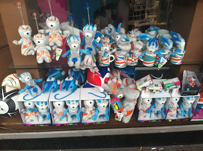
Not as ugly as the mascot, though:


Is the mascot a one-eyed worm monster? I think Cobi from the Barcelona games will always be my favorite Olympic Games mascot.
ReplyDeleteSupposedly they are drops of molten lead who have fallen from the construction of the stadium, I think. And Cobi was ADORBZ
ReplyDeleteThe logos look vaguely Schutzstaffelesque, if you get my drift.
ReplyDelete